Empty
If you want to change that, support J\V.S and/or pick up some sweet goods, try some of the links below.

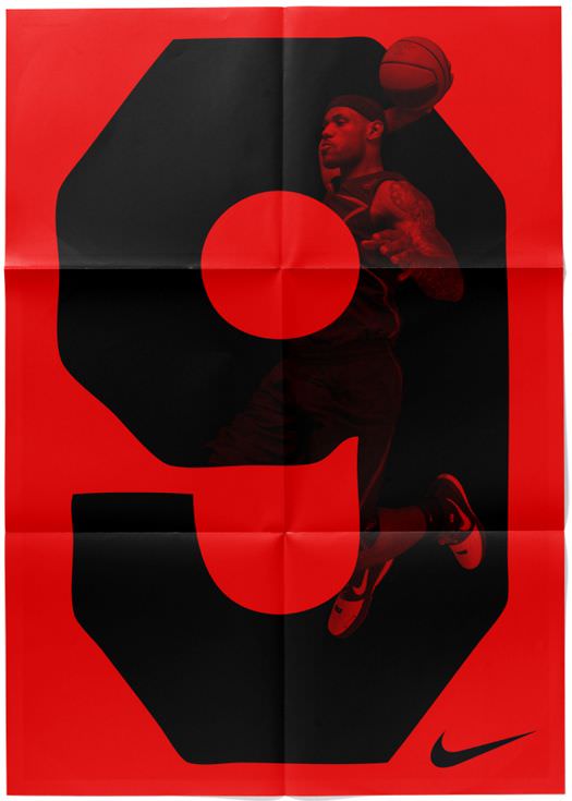
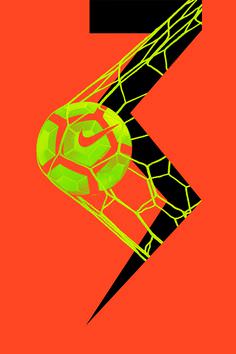
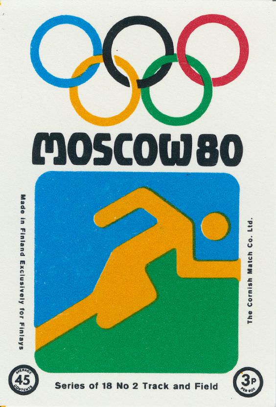
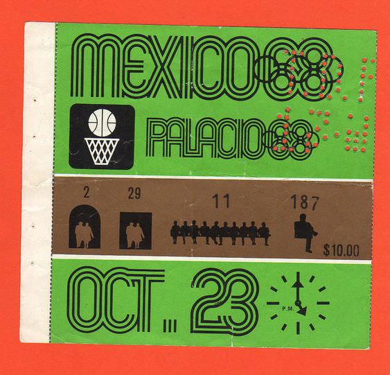
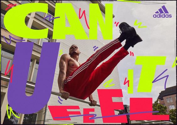
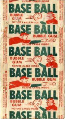
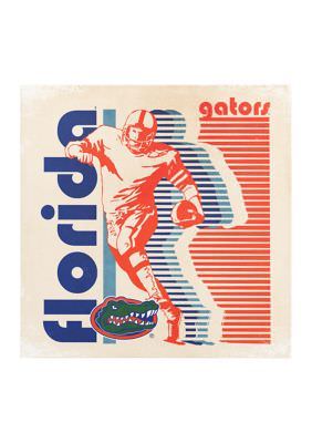
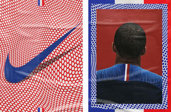
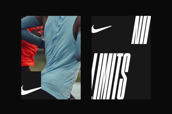
The art (and design) of sports is heavily trafficked with great design through out the years– the Olympics, old playing cards, Nike's brand campaigns, etc. Carving out an ownable space within it has become harder and harder, but given the dynamic nature of sports, nearly anything is on the table. Restrained and progressive, bold and submissive, editorial and overt simplicity, technical and emotive, etc. etc.
The brand language for Netflix's presence in sports needed to be bold, flexible and unique. Netflix, to it's core, has been a disruptor and risk-taker in their ambitions, and we wanted this design language to reflect that perspective. Doing this meant looking at solutions that were a bit more simple, yet bold in application through color, typography and other visual elements.... without straying too far from anything that could 'feel' Netflix.

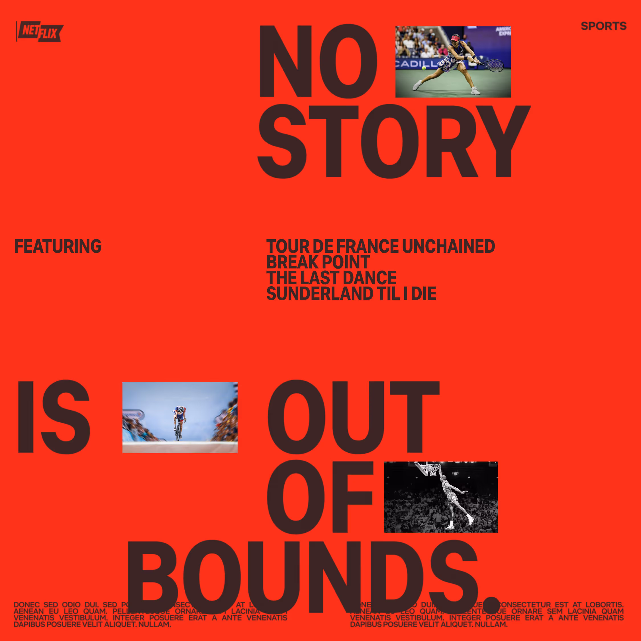
Sport is something of a universal language, yet everyone has their own dialect. While there are through-lines that re-appear quite regularly through the years, there's many entry points that dictate how design is packaged, and what that said design is tapping into within the world of sport. The spectacle, the movement, the commerce, the drama, etc. While Netflix was clearly prioritizing the drama/story-telling, it's important to dive deeper and see what cues we can leverage from the broader sports language in developing our own dialect. Sports is a crowded space with it's own set of tropes that we had to both accept and avoid in different moments to develop something familiar, yet uniquely Netflix.
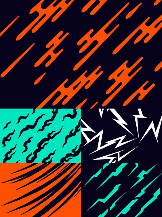
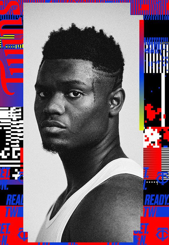
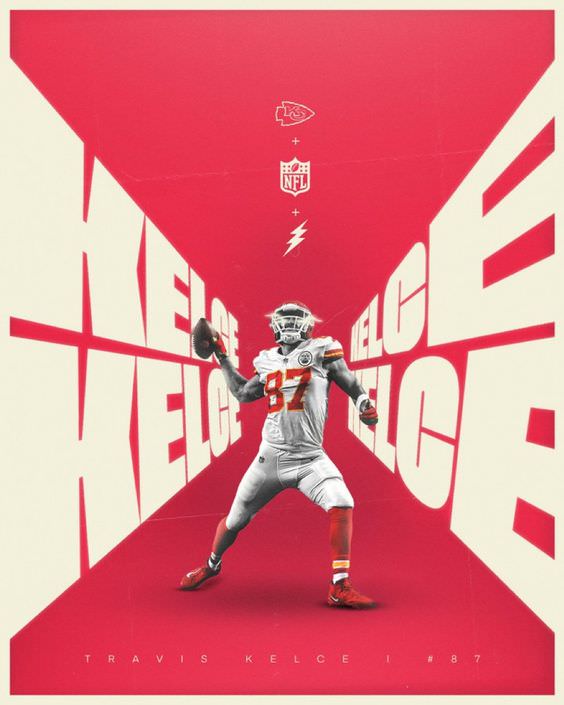
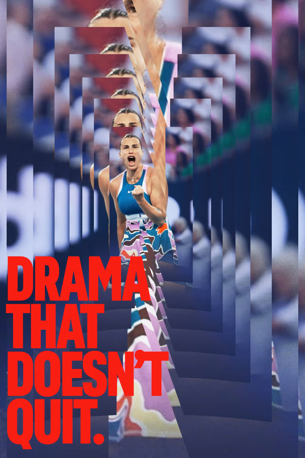
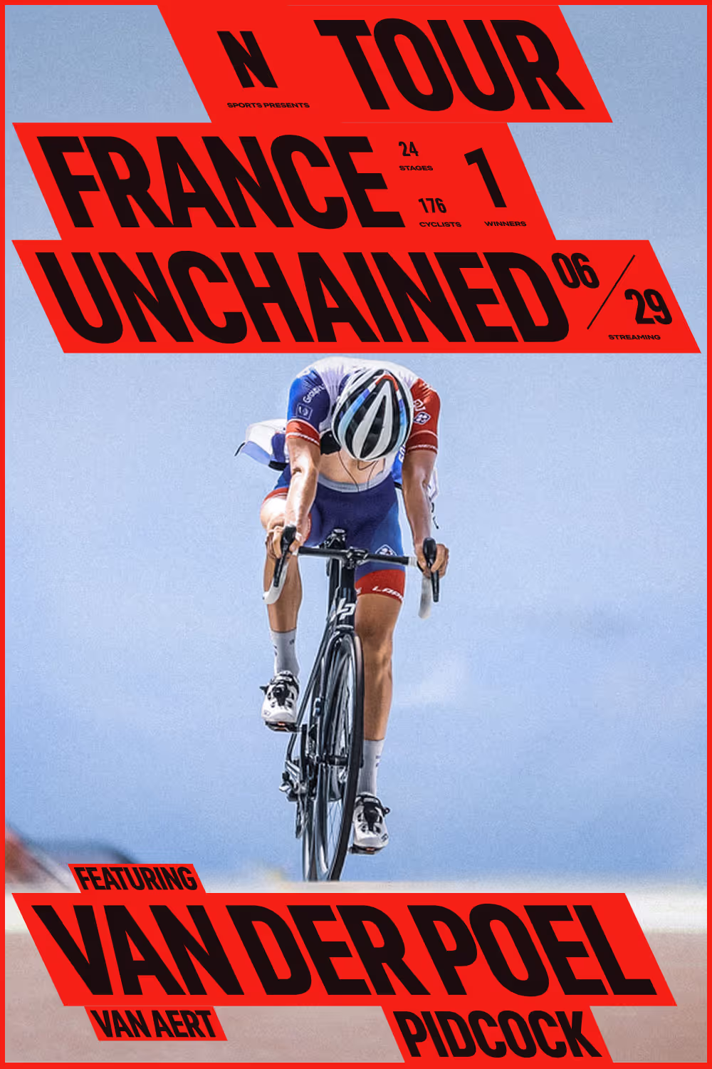
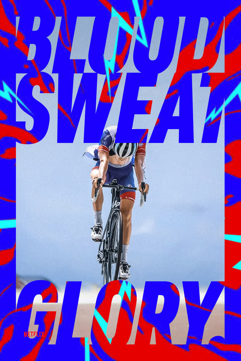
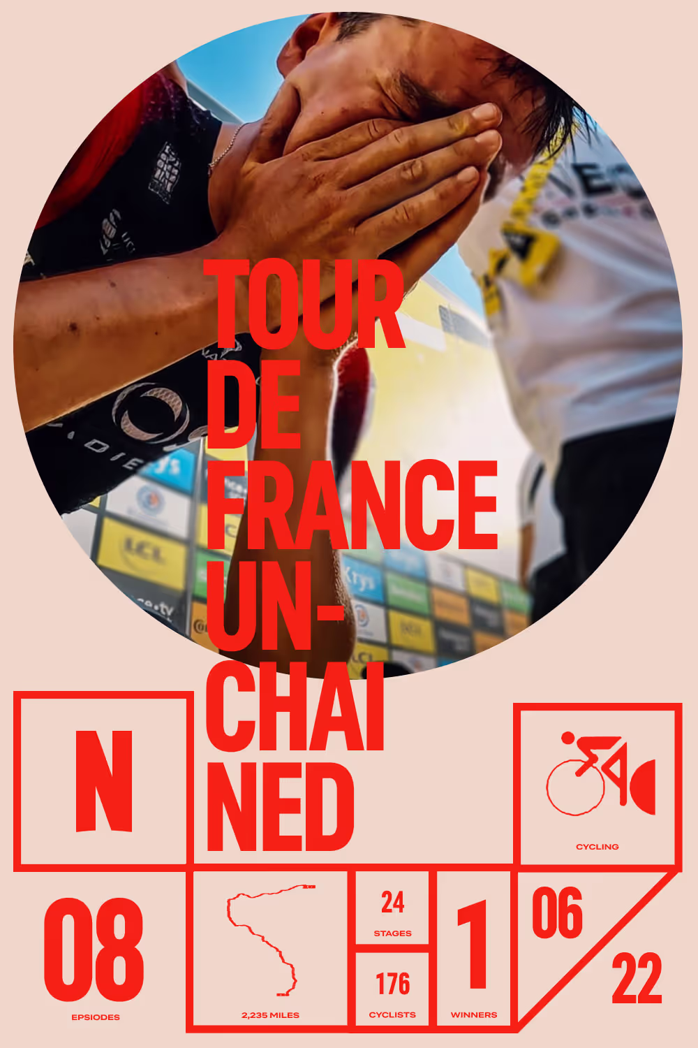
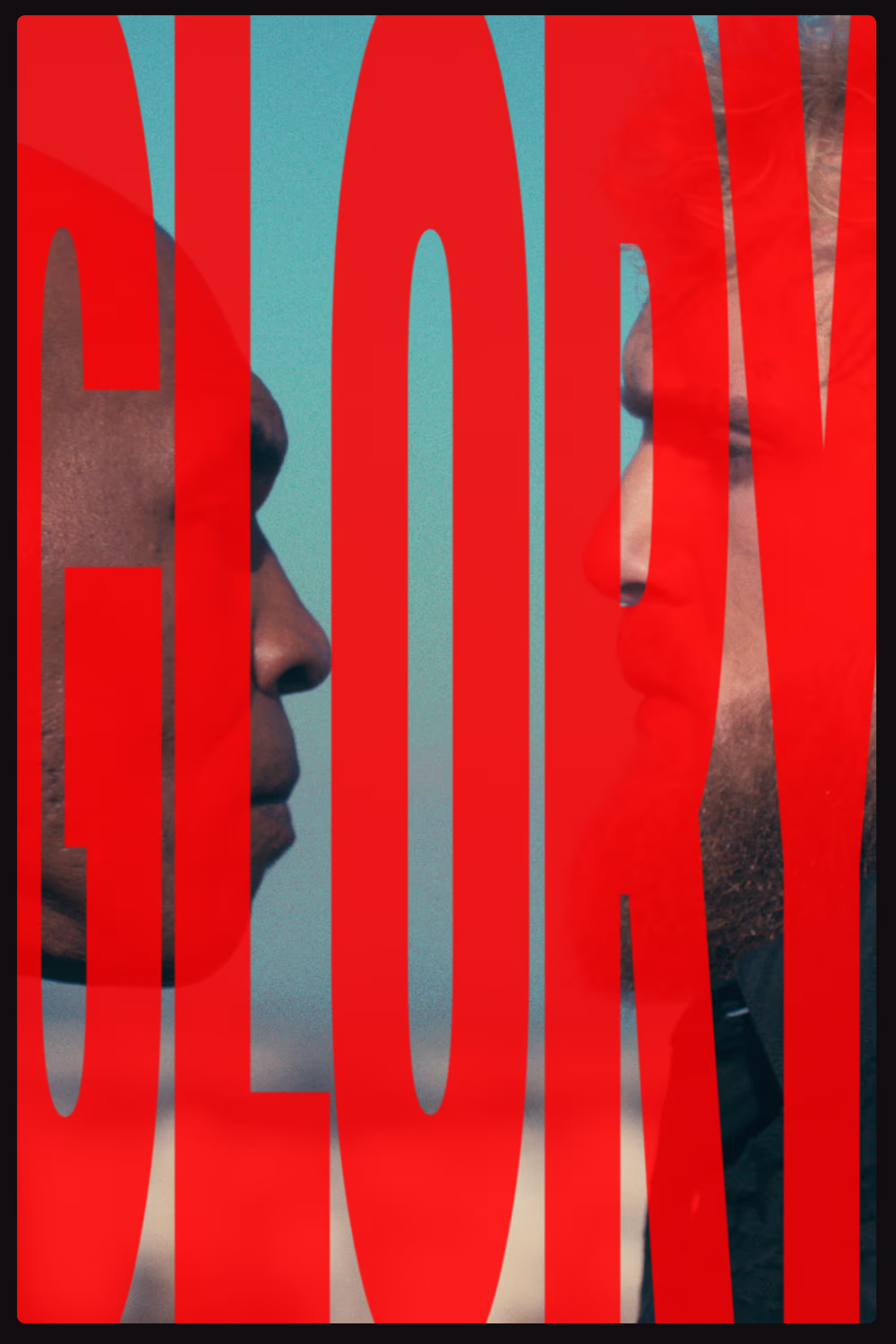
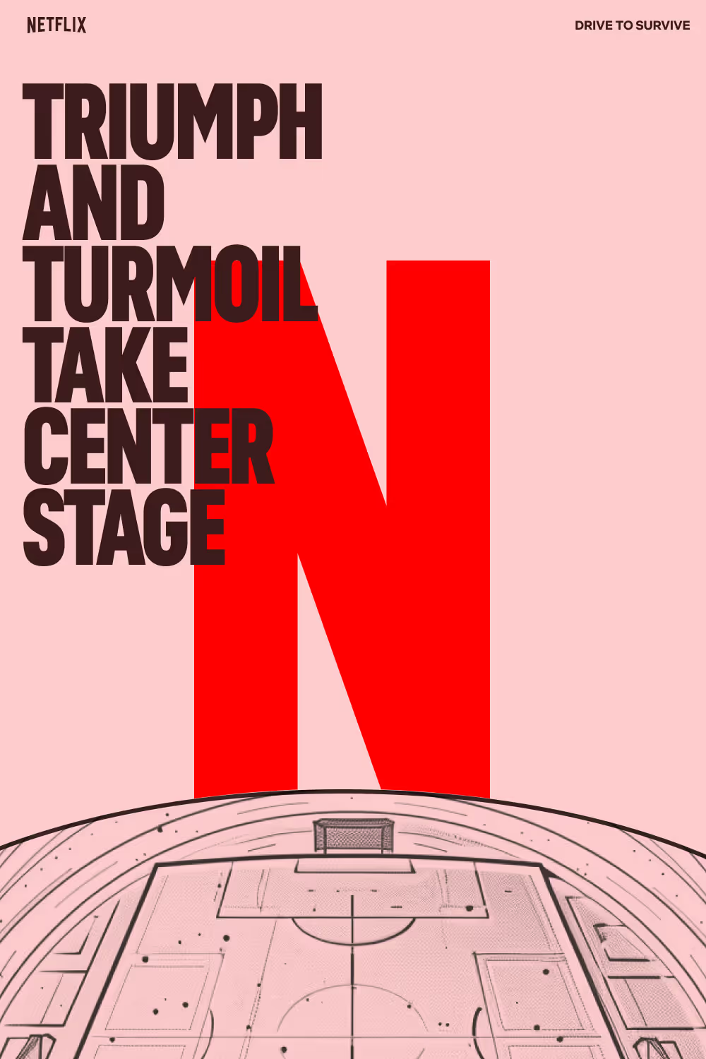
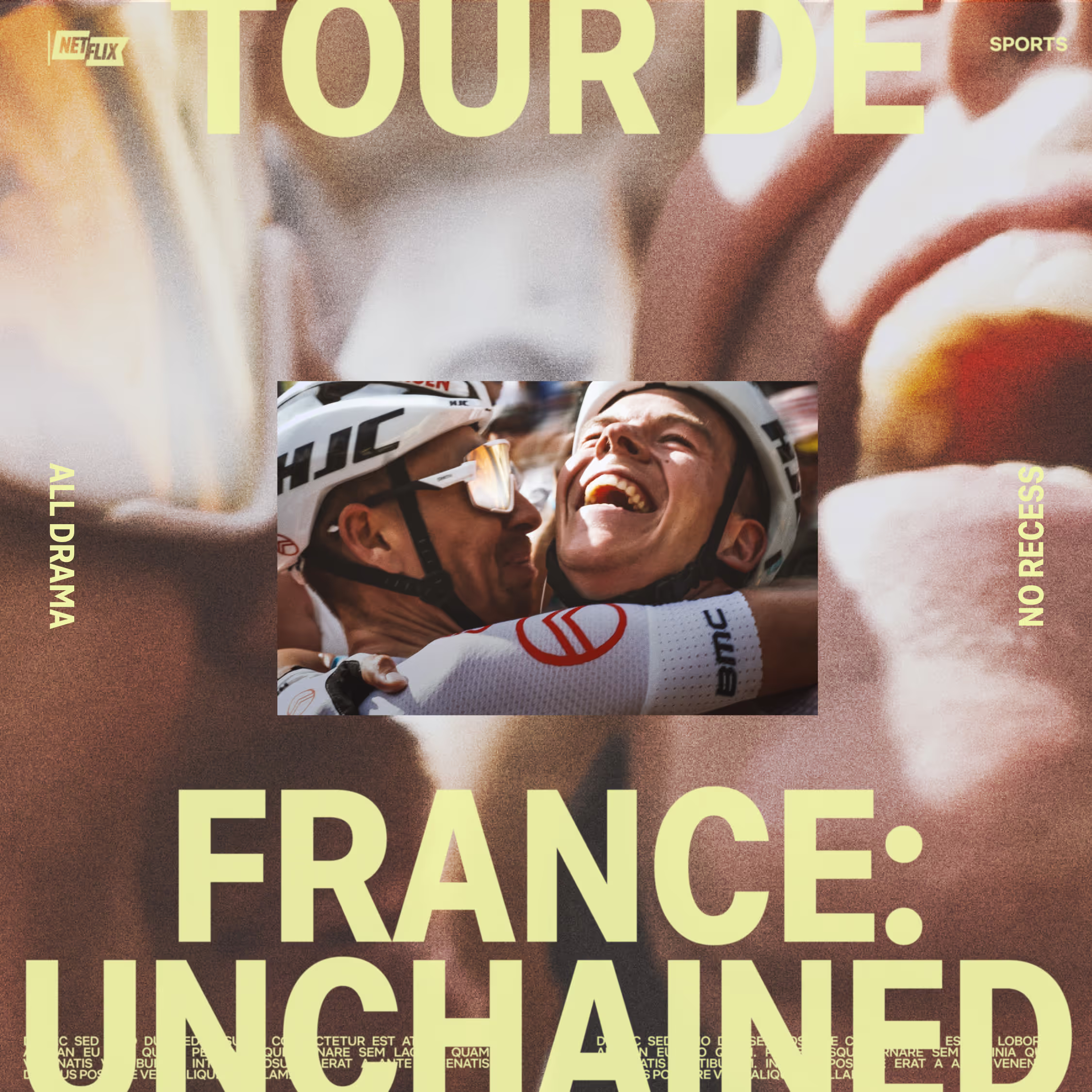
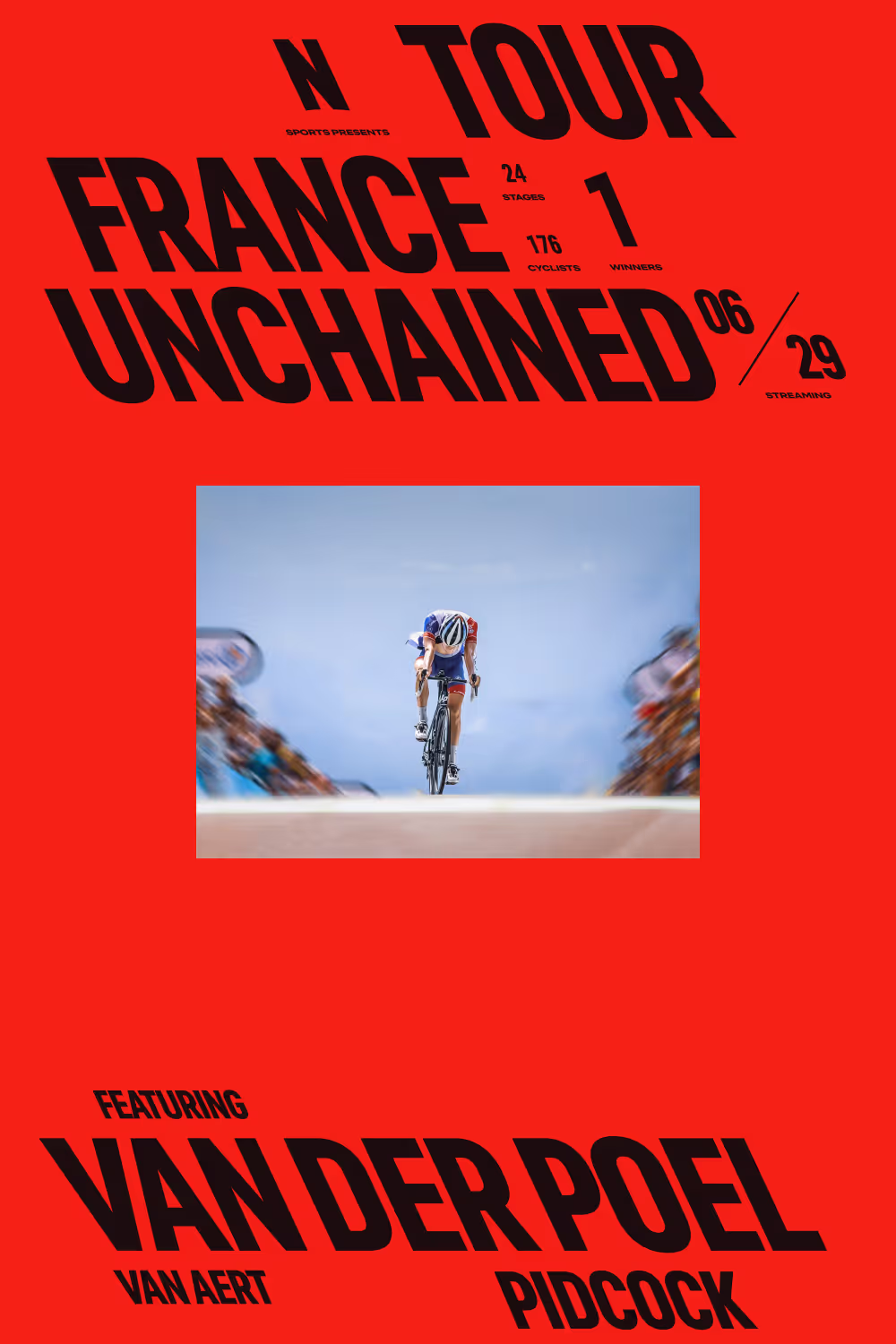
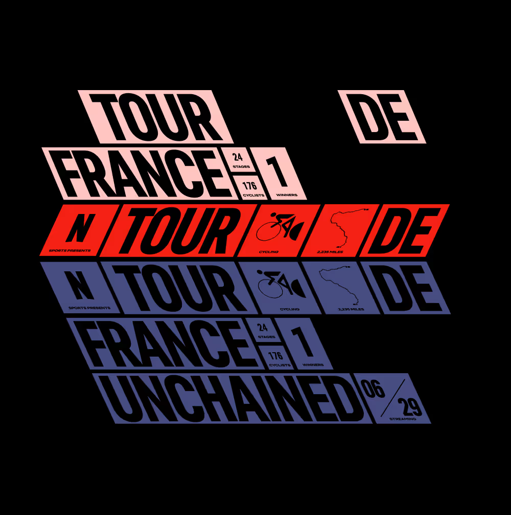
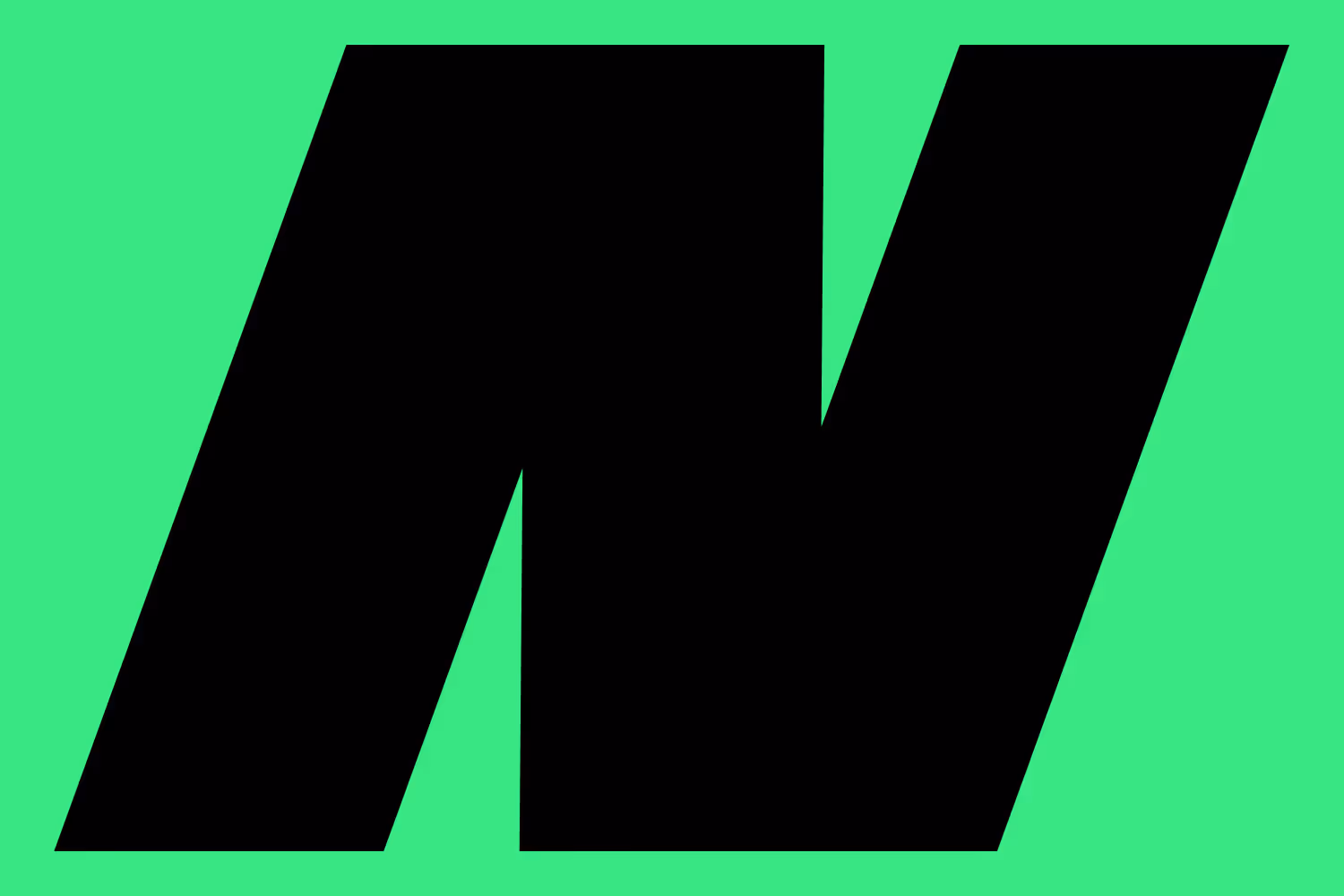
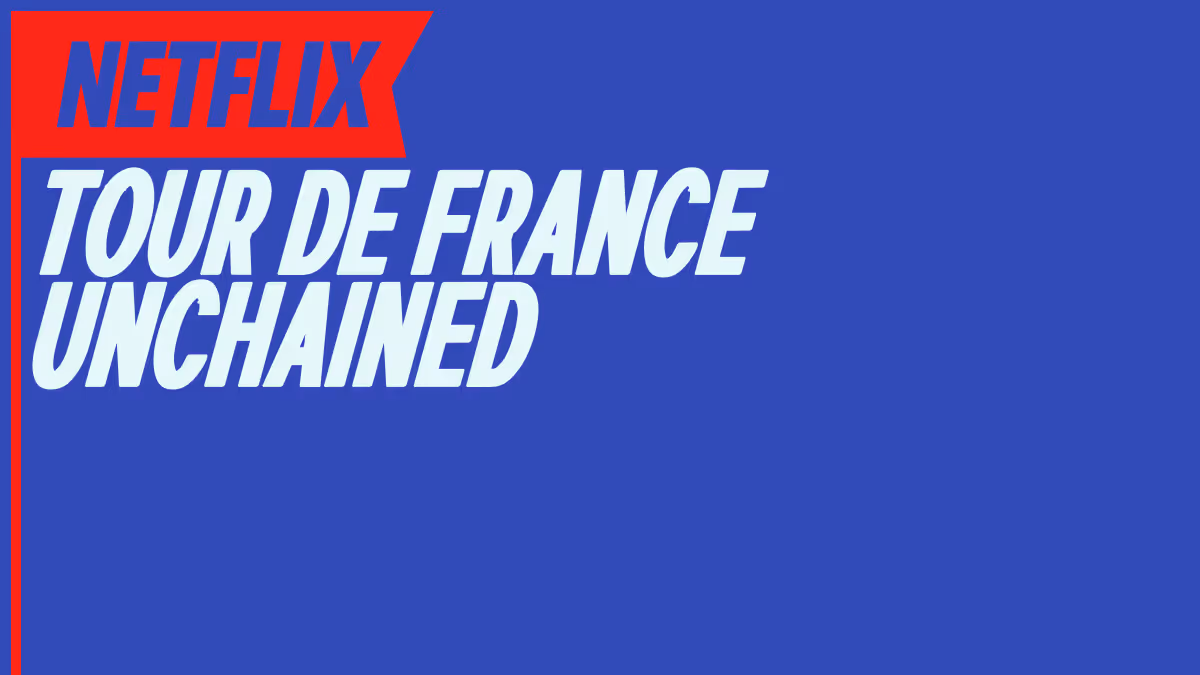
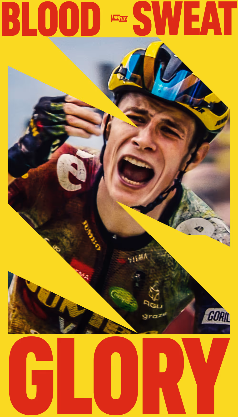
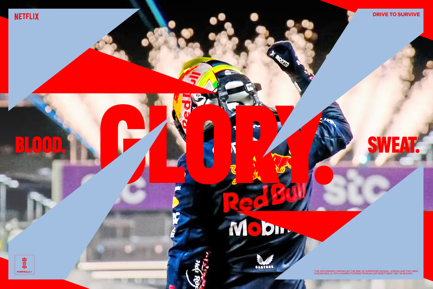
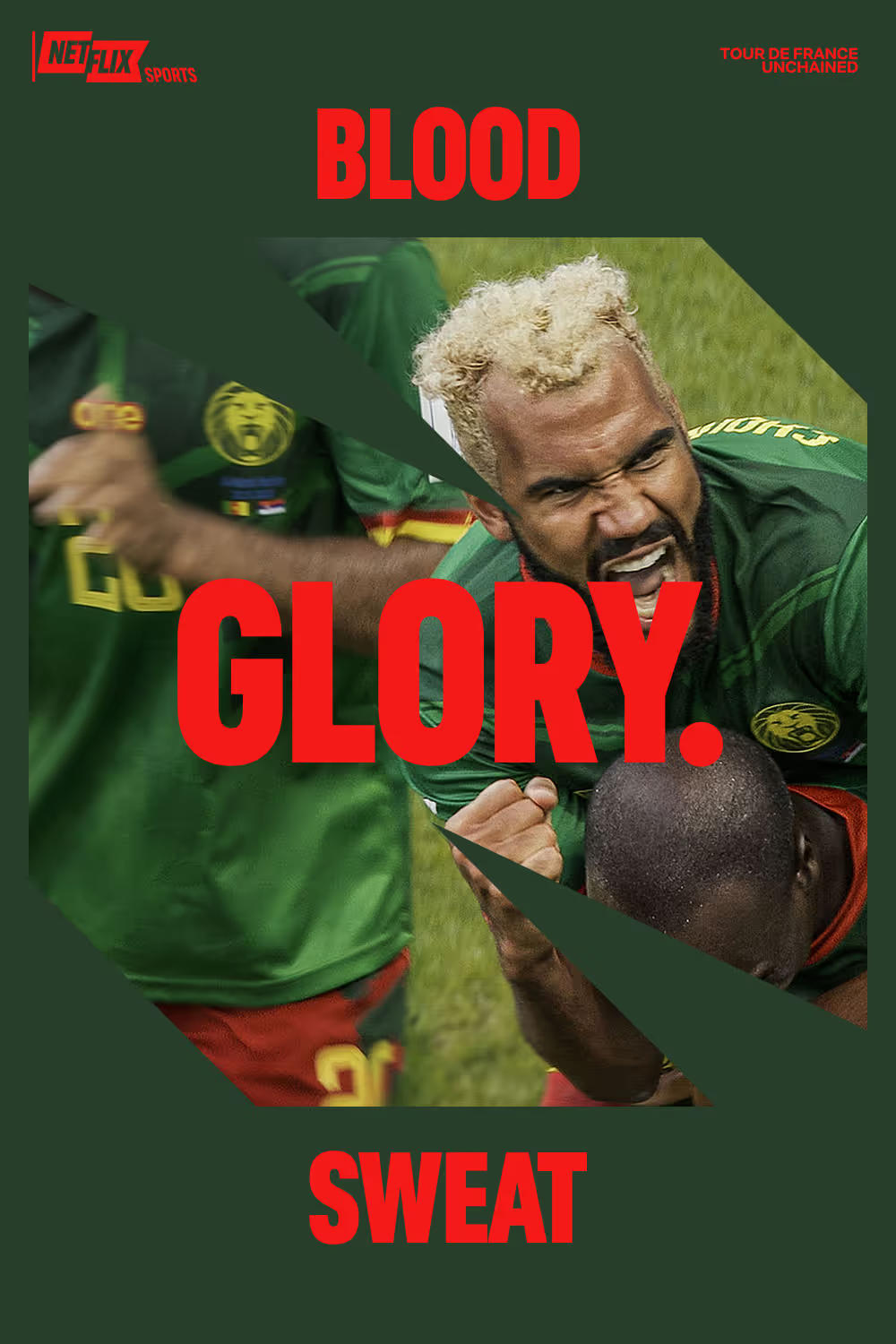
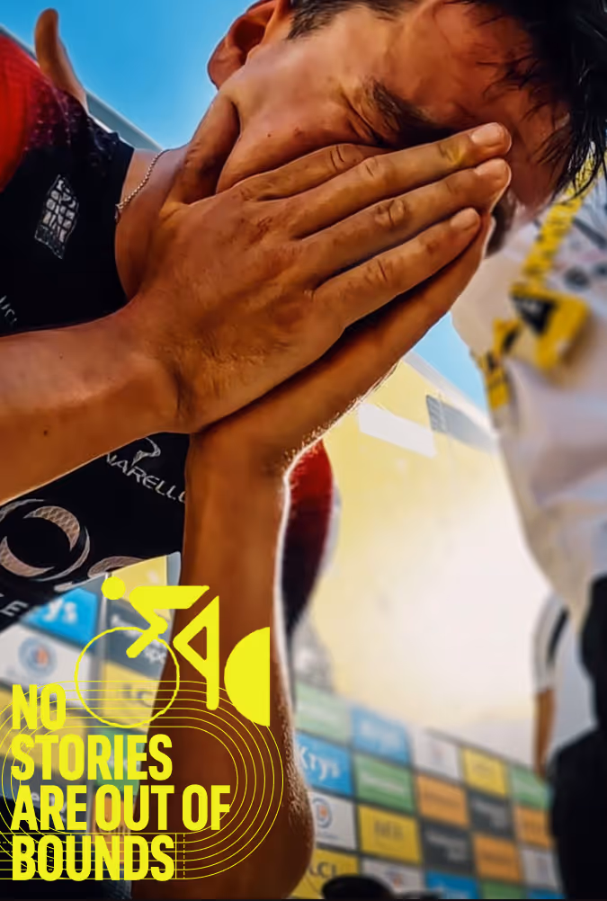
Within the world of sport, Netflix has historically been about the subplots, drama, and spectacle of sport. Using a masked 'N' logo as a driving visual motif, it literally became the lens through which sports are viewed through. While it was primarily about the framing, masked imagery was leveraged as a mean to 'weave' Netflix through the fabric– further implying how Netflix, and the drama they portray, is omnipresent within every sports moment they depict. Visually, the design system was meant to feel dynamic in nature with angular lines and points of tensions which implied movement throughout, and were brought to life with tight easing curves. As one additional layer, a system of patterns were developed as versatile brand elements– at it's core also emblematic of the repetition that goes into mastering sport. These elements were meant to be the foundation for a system that could grow and evolve with time.


When working on branding projects, I've learned to trust my gut. There's usually something of a clear idea that quickly comes to mind, and while the final incarnation of that idea can be far from the original, it more often than not becomes the genesis of what is pushed forward. In this instance, the use of the masked N as came about almost immediately as something dynamic, ownable, and on brand for Netflix. While the idea came quickly, there was a lot of work in figuring out the details of it's application because, as I quickly found out, without more definition, it became a tricky visual motif to work with at times that created risk for scaling production. The team was able to help develop standards and guidance around it's usage that Netflix was ultimately comfortable with.


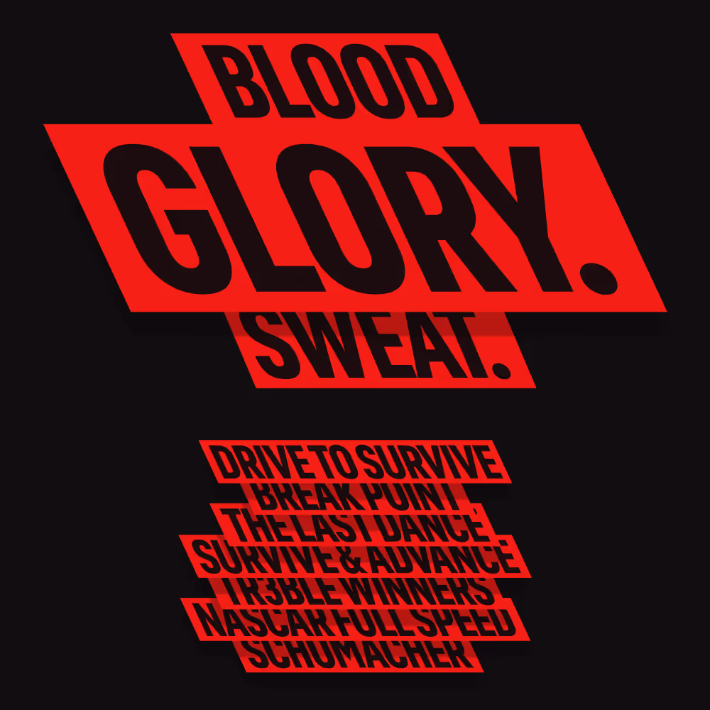
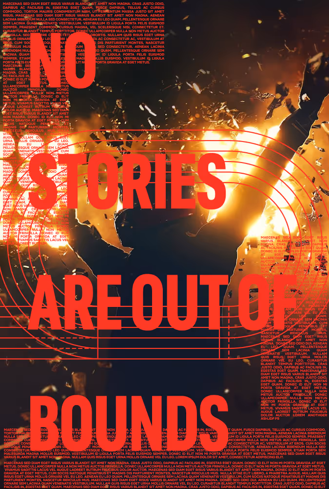
As it usually happens, there's a lot of interesting things that happen along the way to landing on the end result. Most of my process work is fairly rough as I take a loose/iterative approach to avoid needlessly over-indexing on polish when it's not yet necessary. Below are excerpts from moments along the way to the end results above. Sometimes my favorite work is in here, some time's its garbage as a means to show what we shouldn't do.